

eCommerce is booming & so is “EXIT” rate for any of the eCommerce websites from users standpoint. So, to avoid the exits from your site & loosing those extra $$$ make sure you optimize the conversion rate & avoid leaking customers
Let’s get to the formula straight to clear the dilemma
Number of conversions / numbers of website visitors = Conversion rate
Which tells us that if you received 500 visitors in each day & 50 visitors made a purchase then your conversion rate is 10%
50/500=10%
In my words “CRO helps to seal the leaks” and trust me it seriously does!
How does CRO seals the leak?
- Increases Sales
- Increases the lead quality
- Increases the return in investment
- Increases the TOMA (Top-of-mind-awareness)
Enough said, let’s get to the business of optimizing the conversions.
Below are 21 ways to optimize the conversion rate for eCommerce in 2019
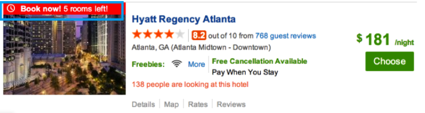
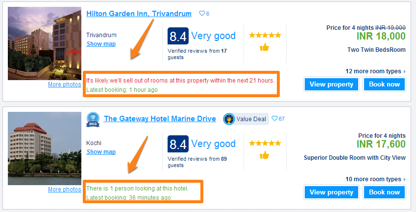
1.Social Proof: People are afraid to make the initial purchase on your website, you need to activate the social signals
Who does it right?

Hotels.com (Sample Search)
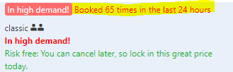
Booking.com (Sample Search)
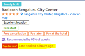
Agoda.com (Sample Search)
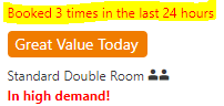
Booking.com (Sample Search)
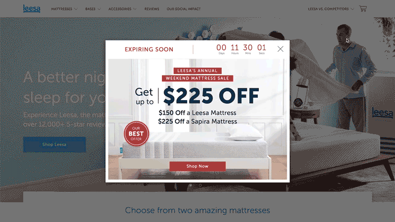
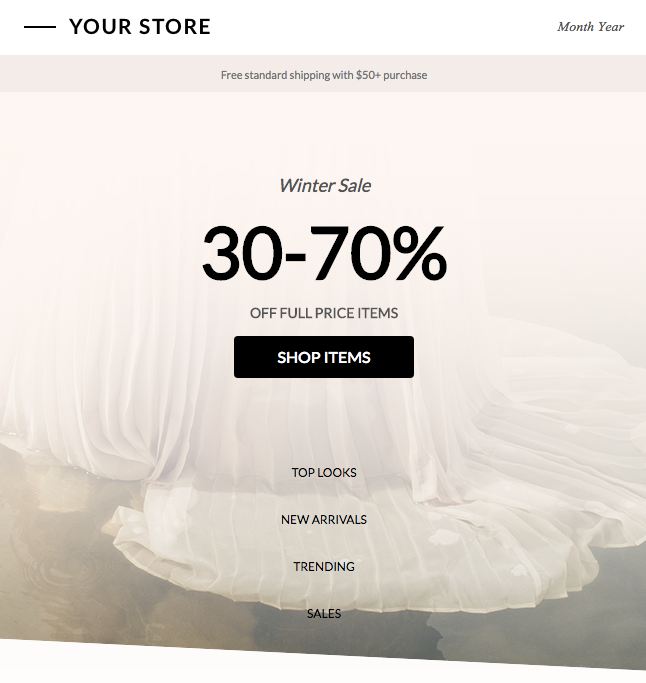
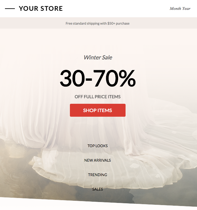
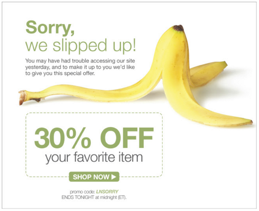
2. Timebox Your Offers: Yes, these are the signals that will increase the chances of conversions on your website.
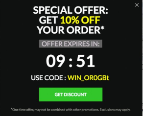
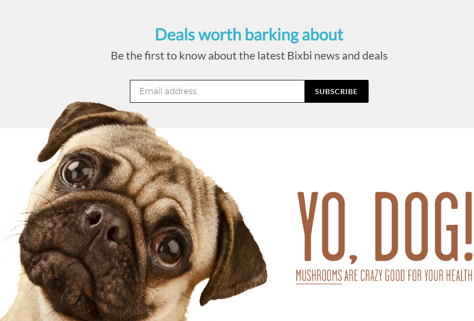
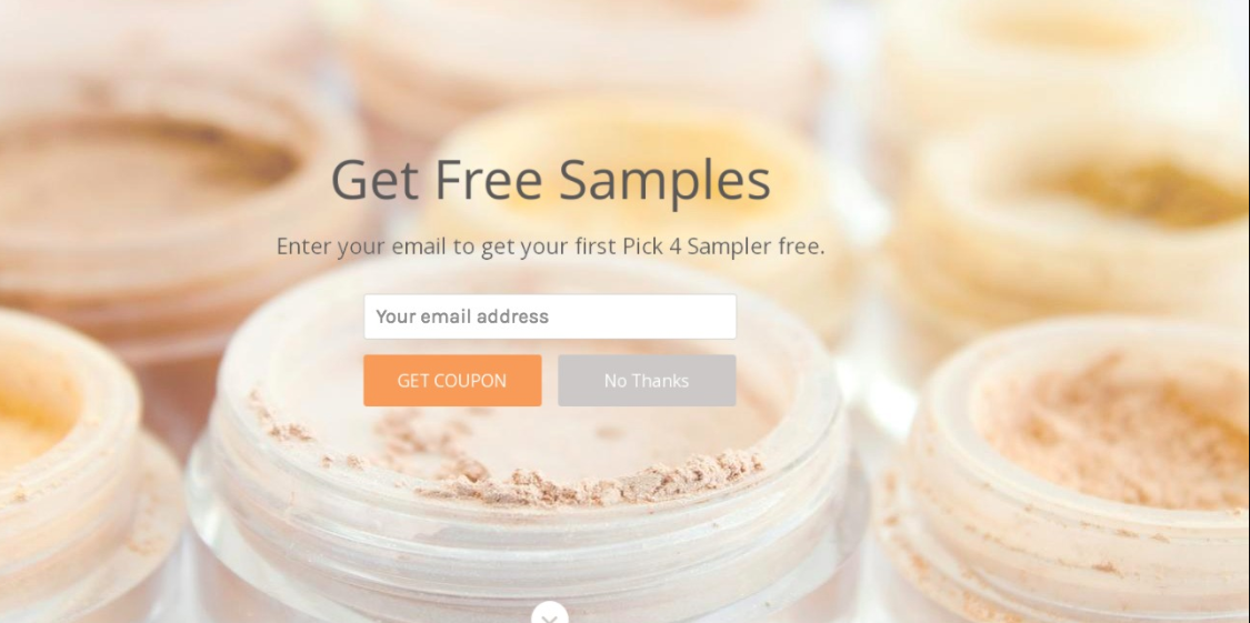
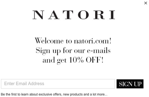
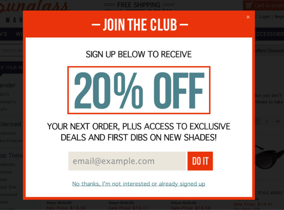
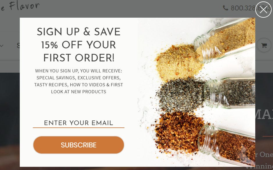
3. Make them subscribe: Yes, there’s no harm in asking for email id/contact details if you’re offering a discount/offer to them & making sure that you don’t spam them 🙂
This action definitely shows user some value when compared to just a “SUBSCRIBE NOW” button
![]()
4. Take Feedback: Let’s be empathetic in asking our users about the web journey and if they liked your site. You can collect feedback either via Chatbots/Scripts or any other form via hotjar/optinmonster or any other website which helps you identify the experience of the user when they visited your site.
 Source: Hotjar
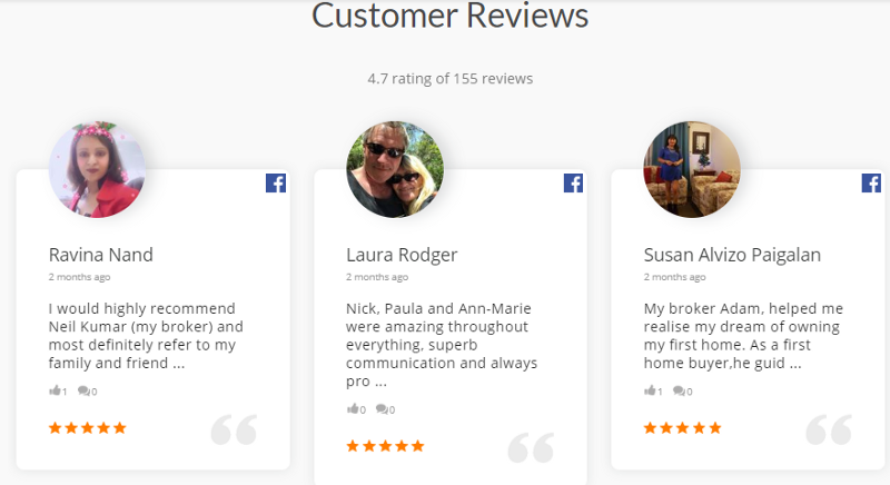
5. Testimonials: Social Media Testimonials are now the game changers for the websites & not just simple reviews. Real reviews help to retain customers longer on the site which directly leads to an increase in search engine rankings
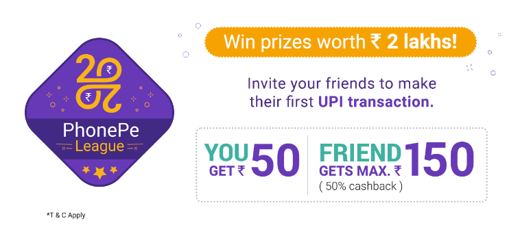
6. Referrals: You can’t undervalue the power of referrals. Some of the industry leaders like Airbnb, Paypal, Dropbox, Uber, Ola, Amazon Prime drove a lot of conversions alone from their referral programs

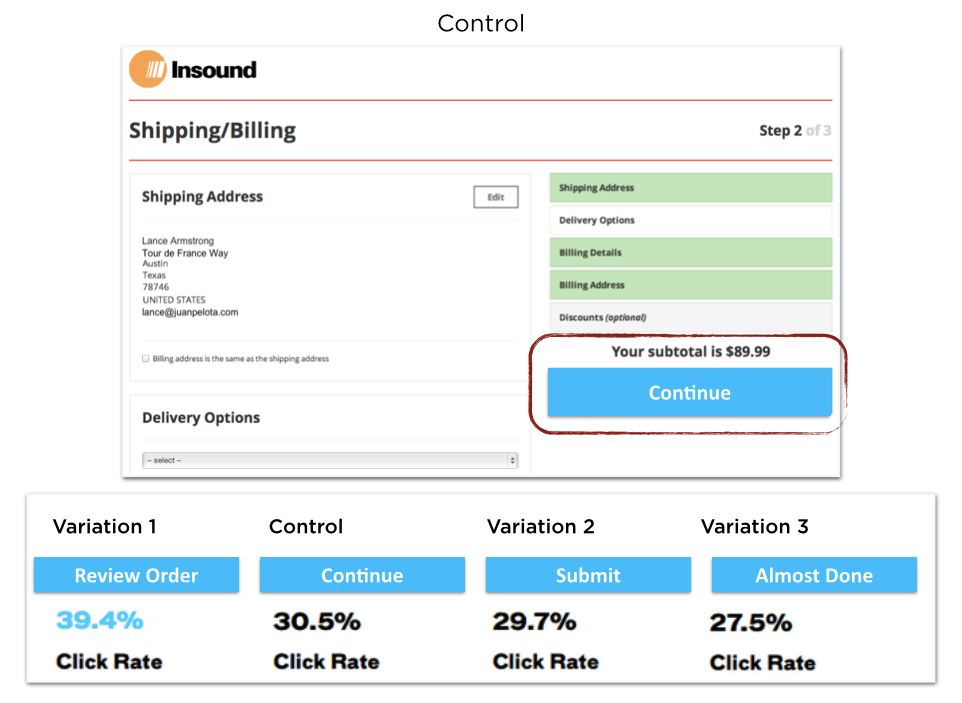
7. Personalized CTA’s: Personalized CTA’s converts 202% better (research carried out for over 330,000 CTA’s
Nudge your user at the right time at the right place without being intrusive with personalized CTA’s
Eg: If a user searches for Shirts then make sure you give them a special offer on Shirts and not anything else.
Even you can make your CTA’s smart, below is a classic example
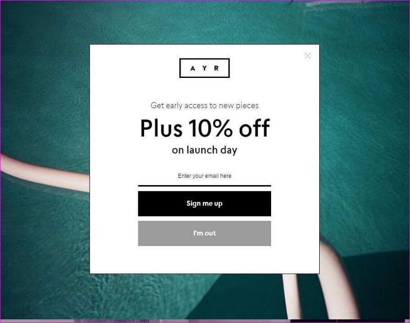
Source: https://www.ayr.com/ (I will definitely sign up)
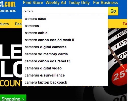
8. Autocomplete keyword option: One should provide autocomplete keyword option on there website, for mobile it’s a must. People don’t want to type the entire keyword and would like to see keyword suggestions
9. Performance Of Mobile Website: Make sure you optimize the performance of your mobile site as that plays an important role in retaining a customer
Study shows 53% users leave a mobile site if it doesn’t loads within 3 seconds. Yes, you heard it right, 3 seconds.
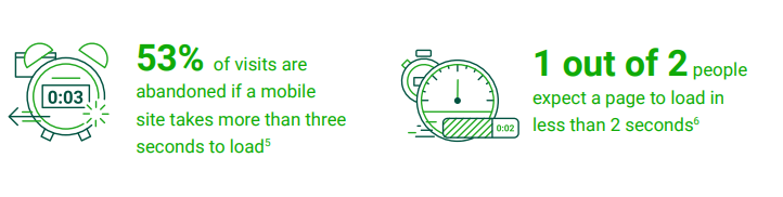
Source: Doubleclick
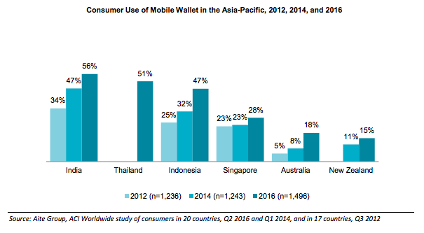
10. Adopt Wallets: The way payments were made in 2005 or 2010 or 2015 is totally different from 2018–2019. For people it’s the ease of use which they would like to see.
I use Paytm Vs my teammate uses Google Pay or one of my friend uses PhonePe or you name any other wallet. Most of the brands these days carry all the options bundled with offers given by the wallets
In 2016, wallets market was valued at USD 594 billion and estimated to be USD 3142.17 billion by 2022 (Source). Be sure to implement this tactic on your website to jump your sales by some “X” percent
Below you’ll see how wallet market grew from 2012 till 2016 in entire APAC
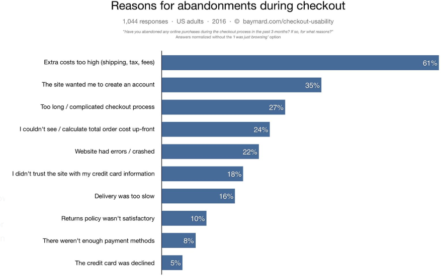
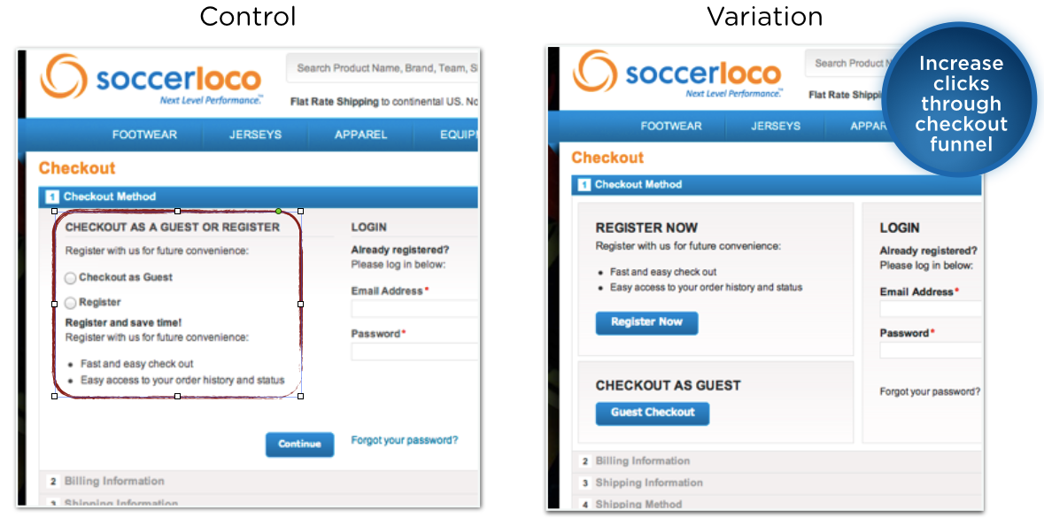
11. Check-out page: One of the most important pages as a person has read about your brand, got some assurance and made up his mind to actually go ahead and make the purchase. But all checkouts don’t happen & more than 60% goes to cart abandonment
Any site should offer the following in there checkout pages:
- Clear breakup of costs (No hidden costs)
- Guest Checkout
- Simple checkout process
- Secure site
- Updated Return Policy
- Enough Payment Options (Wallets/Netbanking/COD/Buy Now Pay Later- Lazypay etc.)
- Alternate Payment Options; if your netbanking fails then give option to pay from other methods/Cash (Box8,Swiggy are doing it perfectly)
The above methods will help you to reduce the card abandonment & you can see the growth in sales
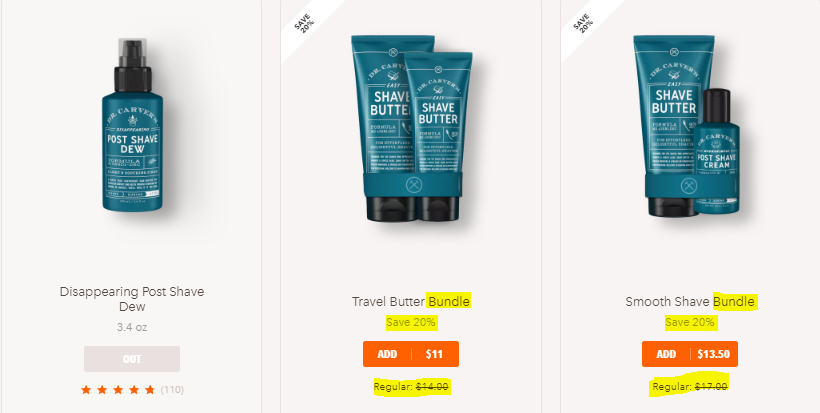
Below is my personal favorite in grooming essentials website where I bought from within first click

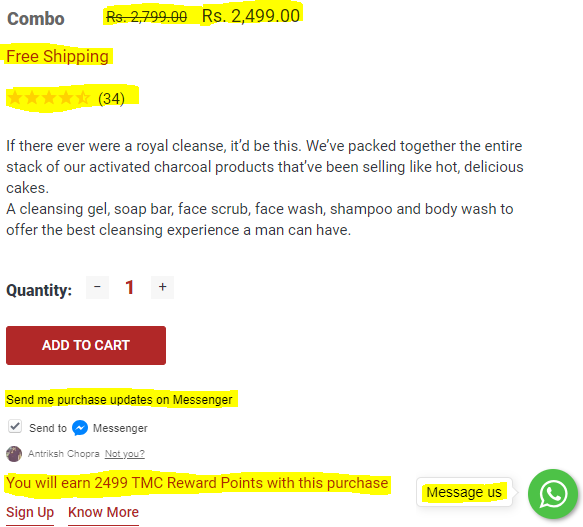
From the above screenshots of a checkout page things which interests users are below:
- Coupon code right on the checkout page (Subtle insertion at header of the website)
- Price (The way it striked off the price from INR 2799 to INR 2499
- Free Shipping (which means user doesn’t have to pay EXTRA)
- Reviews (34 people have give their feedback which acts as a social proof for a new buyer)
- TMS Reward Points (Just like what Bewakoof.com does, creating a trigger for next purchase)
- Message Us (option via Whatsapp via which a person can easily talk to a representative in case they need to make any requests)
- Purchase Updates via Facebook Messenger (which also will act as a source for disseminating information about future products/new launches/sales/offers/discount coupons)
12. CTA & Pop-up’s Placement: Call-to-action and pop-ups act as one of the major source of leads/sales when placed correctly on a website.
Positioning it at desired point where your users might take or would want to take desired actions.
Remember, a CTA button is not;
- Text
- Hyperlinks
- Gifs/Memes
Making changes is one thing but making sure you keep the essence of the button is another important characteristics. You should experiment & be creative with buttons but not so much that people can’t connect if that’s a CTA button or a normal text/anything else

Livestream, clearly has one major CTA which is to get people started which will drive major conversion/actions but that also is supported by other CTA buttons like- Request Quote, Go Live. But “Get Started” stands out because of its vibrant feel
There’s no science to whether a CTA button should be above the fold or below the fold. CTA button should always be placed according to the complexity of the page (above or below the fold)
Most of the website owners test many aspects of the CTA button- color, shape, fonts. But by far, most important aspect of the CTA button is the “COPY”. Yes, you read it right, COPY
For eCommerce there are many ways to use CTA’s/Pop-ups which will drive conversions:
- Add To Bag/Add To Cart (when placed properly around your product)
- Social Sharing buttons to share with your friends/within your circle
- Subscribe For Offers/Discounts
- Stay Tuned
- Explore Offers
- Last minute offers/Timebound
- Claim Your Discount
- Referral Button
Above CTA is coupled with an effective copy where a pet owner can relate themselves positively & chances to subscribe would go double from an average CTA button
Below are some points which define how to create sense of urgency/scarcity among users while you’re in eCommerce
- Last minute offers
- Free Shipping if you order within 2 hours
- Coupon Codes; flat 30% if you order within an hour
- Limited edition
- Last few units left
- Low Stock Alert
- Freebies for first 100 users
- Abandoned Cart Offers
- Early bird offer
- Countdown
- Clearance price
- Social Proof

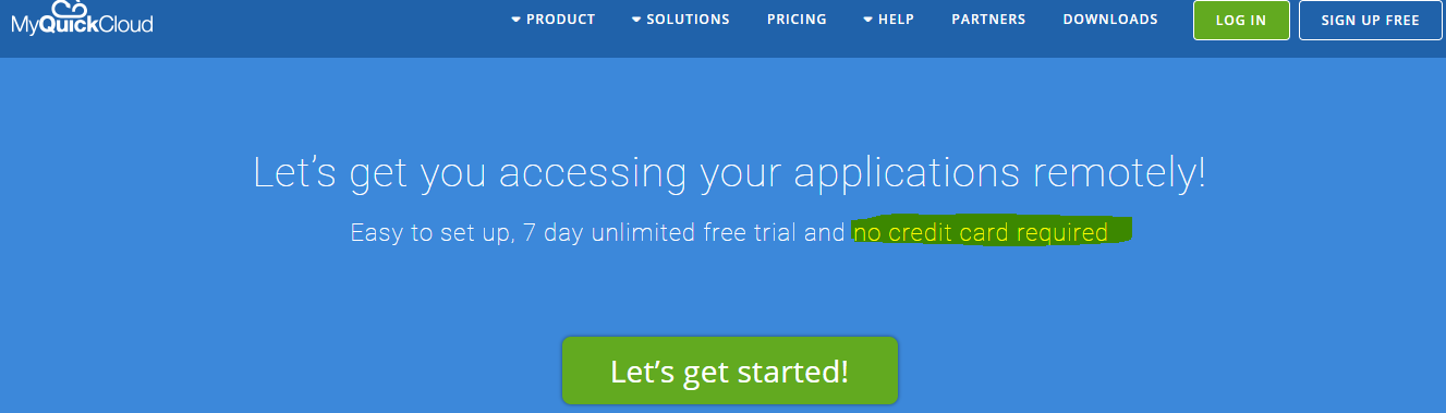
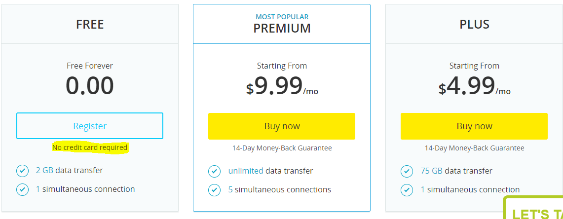
14. Bonus Button Text: Indeed, many business entities or users want to feel that there money won’t go anyway or they won’t be charged or are not charged additional.
Fear of online shopping is not be scammed and for companies to give assurance we need to give as online business
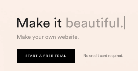
CTA is clear- Bold Color, very appealing but if you see the bonus button text “No credit card required” which makes sure that no user bounces, as many users are skeptical to give details or start trial thinking they will be charged”
15. Relevant Filters Only: Have you heard the the quote “Too Many Cooks Spoil The Broth”, it’s very apt when it comes to filters
Filters are your first step for a user to find the right match as per there needs/desire or why you have got them to the site via paid/organic efforts
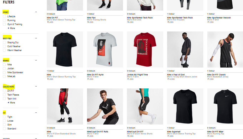
I’m a big fan of Nike.com personally, the way filters are used- type of sport, best for, collections, fit followed by color
It so easy to pick when I’m looking for Winter wear followed with what I’m buying it for (type). Many eCommerce adds so many filters that it confuses the users and at the end they tend to bounce off from the website
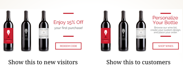
16. Suggestions: Whether it’s related products, cross-sell, upsell or bestsellers we should make sure to show it to our users in an effective manner by not disturbing the user experience on the site or while surfing for products
Either a user lands on a “0-result page” or exploring a collection or a particular section, we can show users some personalized recommendations either based on user’s previous purchased data or through most viewed items in the site
17. Action Oriented Words: Persuasion is key when it comes to eCommerce conversion
One should be able to persuade a customer to click and take the desired action. That’s how you will be able to convert your customers with the power of copy
Best action verbs which usually increases the chances of conversions are:
- Get Access
- Subscribe
- Place Your Order
- Add To Bag
- Shop Now
- Checkout


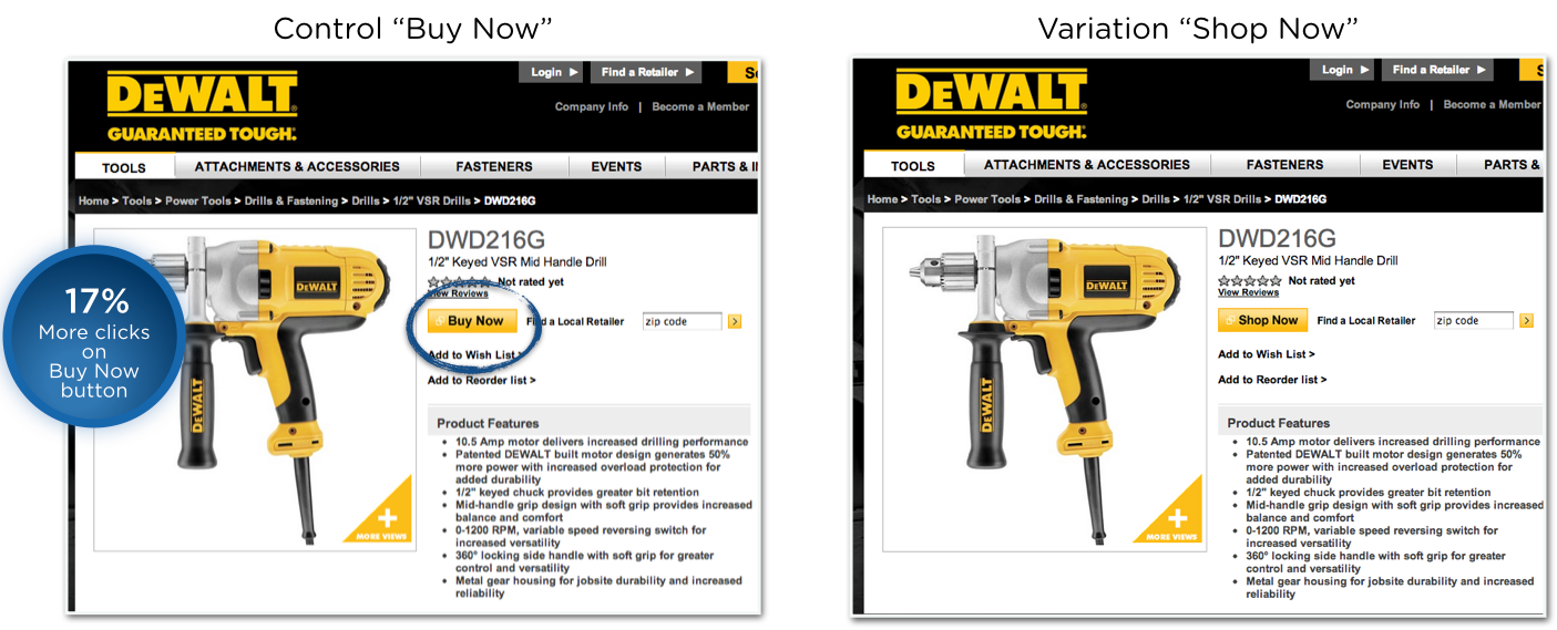
18. CTA Analysis: If you’re running an eCommerce store/site and want to outsmart the competition then it’s very necessary to carry out analysis of your CTA’s at regular intervals
Some of the most commonly used CTA’s by eCommerce brands are as below:
- Add to cart
- Checkout
- Add to wishlist
- Buy Now
- Save To Cart
You can make the following changes to the CTA’s to test:
- Color: Yellow and Orange creates optimism while blue instills confidence and green is known for relaxation or freshness. Always make sure that you use contrast colors to be more appealing to your audience/site visitors
- Size: Button should be noticeable but too much increase in size of the button can deter the experience of the site visitor. One should also keep in mind the rendering on mobile devices when considering button size
- Position: Whether to put above scroll or below is a debatable topic but a website owner should know where to position the CTA button correctly. One can play with aligning it to left or right but should also know it’s audience (For eg: In MEA, buttons can be placed on left while in Asia buttons can be placed on the right considering the patterns of reading)
- If required, add secondary CTA like, free shipping over INR 1000 which might trigger to save money on shipping (As all businesses can’t be Amazon/Flipkart to offer free delivery)
19. Be Human: Might sound little odd but a website owner should always display contact us info for all the users at any phase. A website is there for profit but should be empathetic always.
Everyone coming to your site might not be comfortable talking to a chatbot/social media sites but rather would like to talk to a human
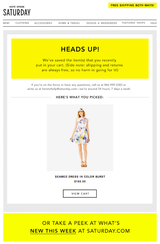
20. Trigger Cart Abandonment Notifications/email: eCommerce sites should always send emails to the users who browsed website/checked out but didn’t make a purchase
Different communication can be triggered as below:
- Send them a coupon code
- Time bound deals
- Stock Alert
- FOMO Appeal
- Emotional Appeal
- Bundling with related products
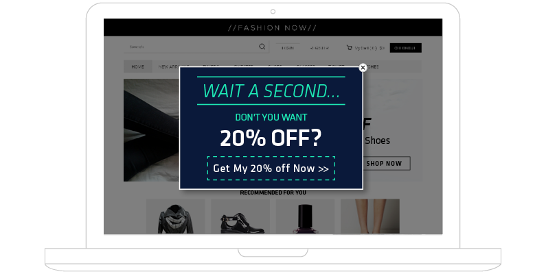
21. Exit-Intent Pop-up (Don’t Let Them Leave): This is one of my personal favorite, why? Because in one of my projects I’ve given the suggestion to my client to implement this (not an eCommerce). Guess what, got an increase in leads by 22% (healthcare)
Exit- intent is like a second chance to convert your user. Don’t just let them leave, offer as much as you can. A/B test your exit intent pop-ups, below are some ways of how you can test for a fashion brand
- Exclusive Offers
- Claim your 20% Off
- Flat 30% on next purchase
- Claim your coupon code
- Claim Your Discount, Valid for Next 24 Hours
- Refer 5 friends to claim 500 Wallet Cash (Wallet cash can be used anytime)
- Join The Gang and Claim Your $50 worth coupons
Conclusion
The only way to scale more conversions for any eCommerce business is to scale up the experiments, make sure to go through more data available via Google Analytics or any other analytics platform used by them, test with the audience and improve the customer experience with every experiment. At the end the power lies with the end user, so make sure to delight them.


Leave a Reply