
Like it or not, PowerPoint is inevitable when it comes to formal business presentations. Perhaps you’re presenting your report after intensive research or pitching a new proposal to your prospect. Whatsoever, PowerPoint is one of the most efficient and fascinating software to accomplish this, if you use it the right way!
In this blog, I’ve consolidated a few advanced PowerPoint tips which will help you use the tool in a much more efficient and attractive way.
First – Always get the basics right!
a. Fonts
i. It’s utterly crucial to keep the font face, size, and type consistent across all the slides.
ii. Try to use the fonts available within PowerPoint, since installed fonts might not be compatible on other Operating Systems.
iii. However, if you’re sure that the viewer is using PC and not MAC, you can choose “Embed TrueType Fonts” while saving the document.
b. Colour
i. Colour plays an important role in subconsciously. Follow a single color palette for the entire presentation.
ii. Use a maximum of 3 – 4 colors for all the elements.
iii. Choose a color palette conforming with the brand you’re talking about. This will increase the trust on you and put an image that you’ve invested time to create a custom PowerPoint for the pitch and not a standard corporate portfolio that you are presenting.
iv. For other business presentations, stick to your brand color or a color palette that is contemporary and arouses curiosity amongst the audience.
c. Avoid text-heavy presentations unless your using ppt to create a text PDF.
d. Images
i. It’s an offense to use skewed images and low-quality images in your presentation.
ii. Viewer views the image first, hence make the most of their attention and add interesting visuals.
e. Use Icons and Graphs
i. Do not use images everywhere. Go with icons to convey crisp messages.
ii. Support your data with graphs and charts.
f. Animation and Transition
i. It might be intriguing to use all the 49 transition styles available in your single presentation. But this will only make your presentation look very amateur. Stick to just 2 – 3 transition or animation styles.
ii. Did you know that with well-planned object animation and transition, you can make a whole animated video in powerpoint? Try it for yourself!
2. Visual References
Use GIFs and showcase multiple visual references in overlaying animation rather than multiple slides. Present your idea with an attractive GIF and consider that it is sold. GIFs are easy to embed in PowerPoint with just a simple drag and drop action. They play by default on slideshow mode and consume less storage space.
When you have several image references to showcase, do not use multiple slides to accomplish that. Instead, use overlaying animation. You can also showcase the reference image on a digital medium to enhance the aesthetic of the presentation.
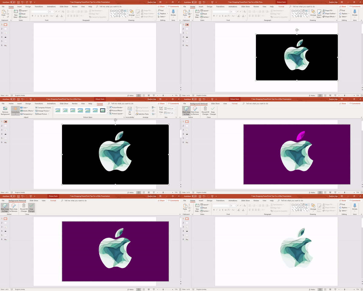
3. Remove Unwanted Background
If your background ruins the aesthetics of your image, then remove the background with the ‘Remove background’ option under the format picture tool.
This effect will work best only when the foreground and background image has a contrasting color.
The tool might not give an accurate result like Photoshop or other photo editing tool. However, this tool comes in handy for quick results.
4. Object Alignment
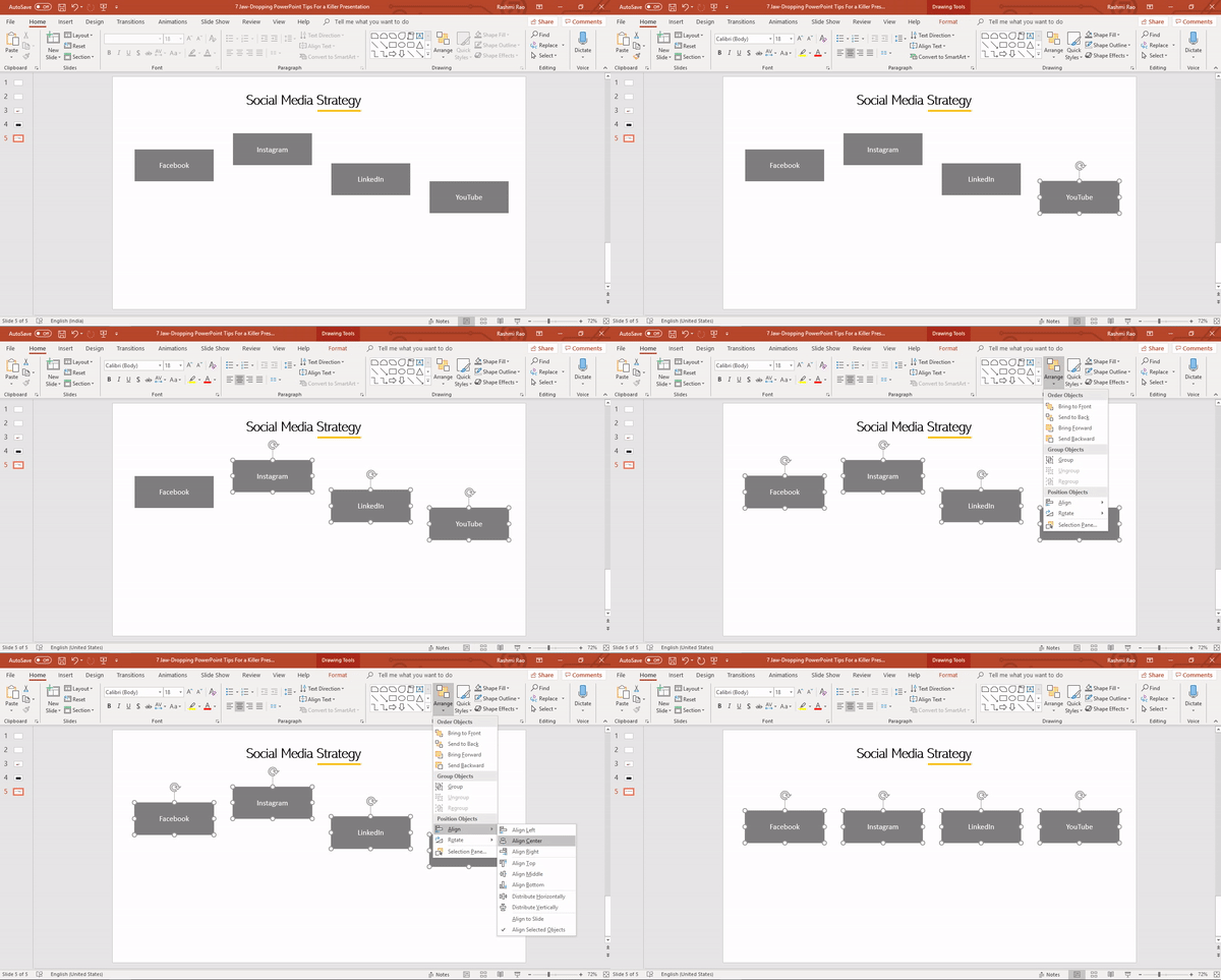
Orderly and rhythmic patterns leave a pleasant effect on the human mind. Always align the objects, texts and other elements in a slide in an orderly manner.
5. Custom Shapes
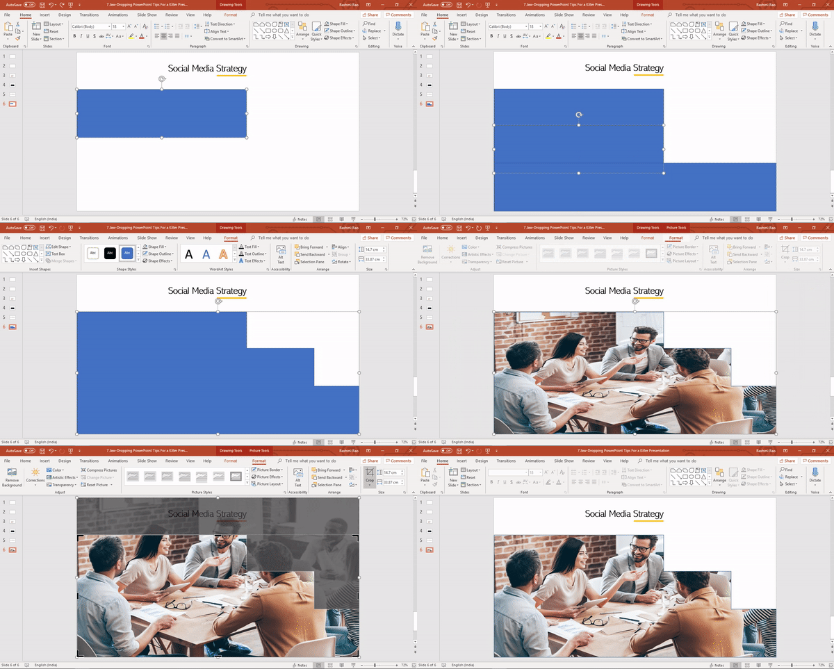
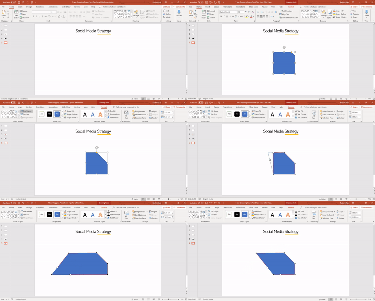
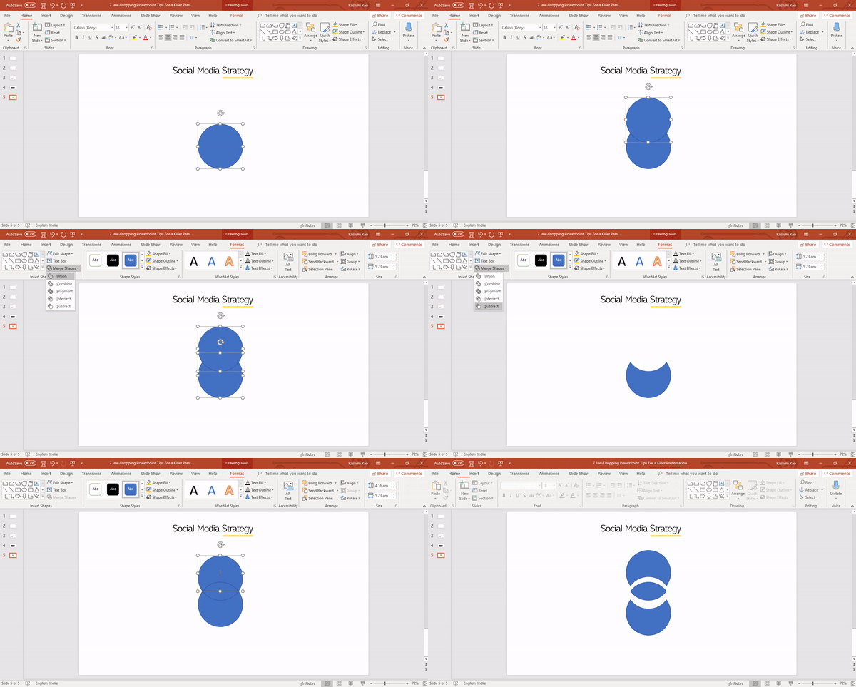
Shapes can covey your message loud and clear than paragraphs and bullets. If you have truly understood that PowerPoint is a visual medium and not a text document, then it’s time to take complete advantage of the shapes available in PowerPoint. There are several interesting shapes offered to achieve this. However, if you don’t see the shape of your choice in the Shapes menu, edit the ‘Shape Points’ or use the ‘Merge Shapes’ options to get your desired shape.
Out of the several million colors available in PowerPoint, use any color of your choice but never leave the shapes in their default blue!
Furthermore, you can also mask images to existing shapes or even to your custom shape.
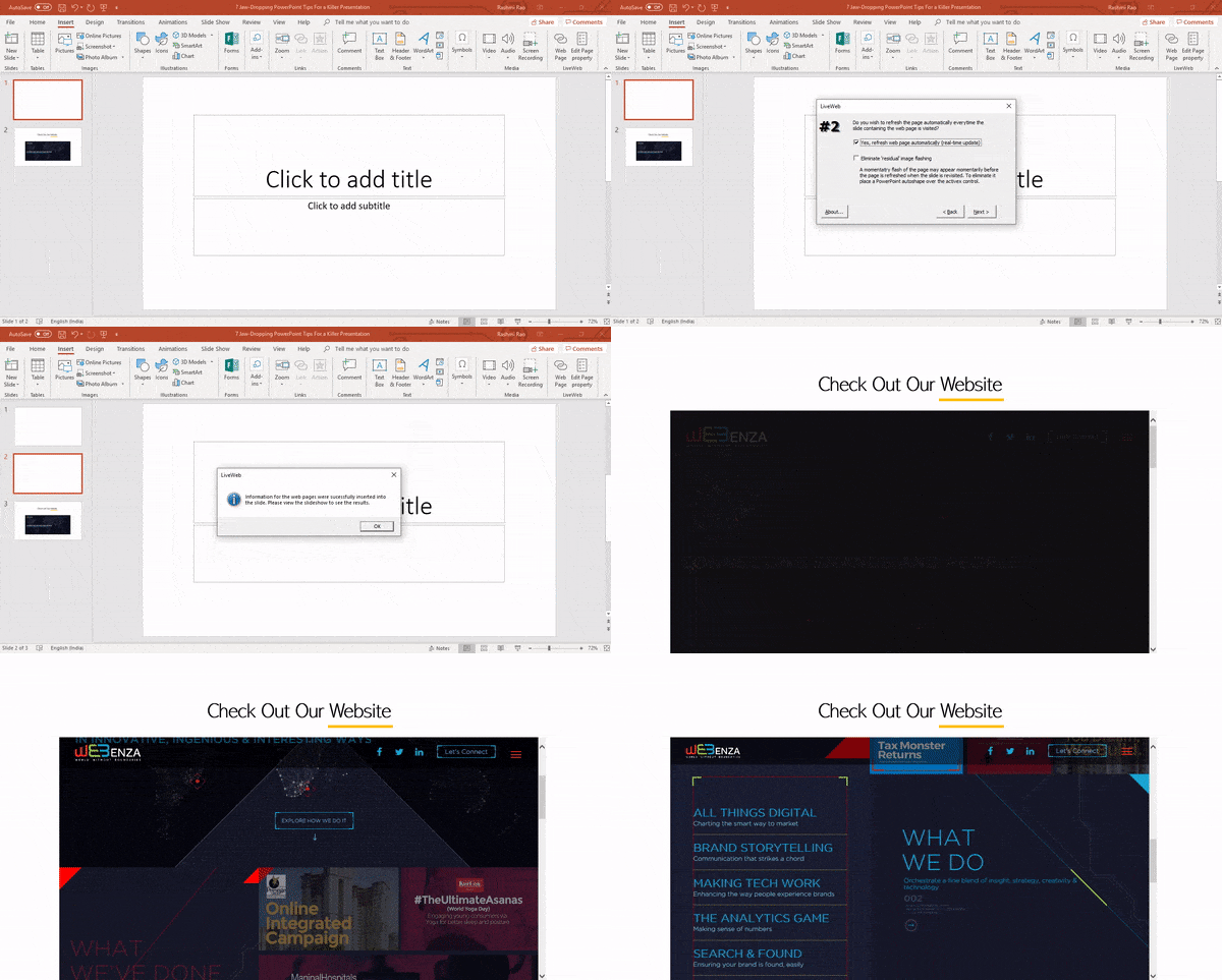
6. Embed Website Within the PowerPoint
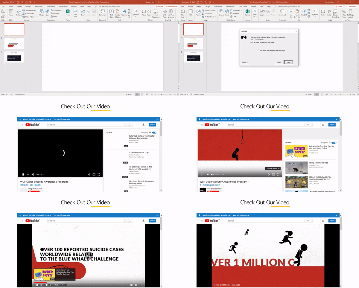
Back in the time, if you want to present a webpage or a YouTube video, you will have to create a link which had to be viewed in a browser separately.
Now, what if I tell you that you can present a webpage within your presentation without having to interrupt your flow and all while your presentation remains smooth and natural.
There are several third-party software that integrates completely into PowerPoint’s developer tab and lets you perform this activity. One of the best software for this is is LiveWeb. Once you’ve installed the software this is how you can set up the Webpage or YouTube page within your presentation.
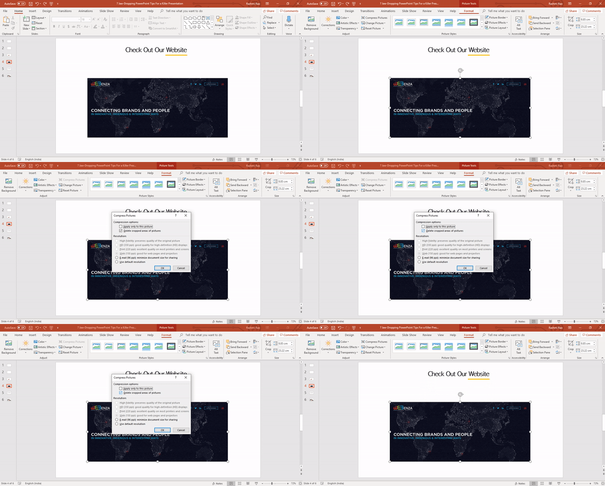
7. Compress Your File
While using a lot of visual references, your file size becomes high. Compress all the images in your PowerPoint to reduce the file size.
Just like any other skills, consistency and practice will definitely get you to the top. When you become familiar with PowerPoint as one of the most powerful storytelling tool, start exploring new options and functions in it. Read more on PowerPoint advanced tips and you might even find yourself enjoying the tool as you keep practicing to master the tool.




Leave a Reply